The biggest mistake I see in the sports betting industry is that most platforms are designed by experts, for experts. They are cluttered with confusing odds lik “-110” and assume a level of knowledge that the average, curious sports fan simply does not have. This alienates the single biggest growth market.
After partnering with numerous bookmakers and designing platforms from scratch, I’ve learned that the key to winning this audience is not more features; it is radical simplicity and building user trust. This guide breaks down the key principles for designing a sportsbook that welcomes new bettors, instead of scaring them away.
The Biggest Barriers for New Bettors
Before we can create solutions, we must understand the pain points. For a new user, a typical sportsbook is a wall of confusing numbers and implied knowledge. The primary barriers are:
Overwhelming Odds: Understanding the difference between a moneyline, a spread, and a total is not intuitive. The presentation of odds is often dense and lacks clear explanation.
Fear of Looking Stupid: New users are often afraid of making a “wrong” or “bad” bet. This anxiety can lead to decision paralysis and cause them to abandon the platform entirely.
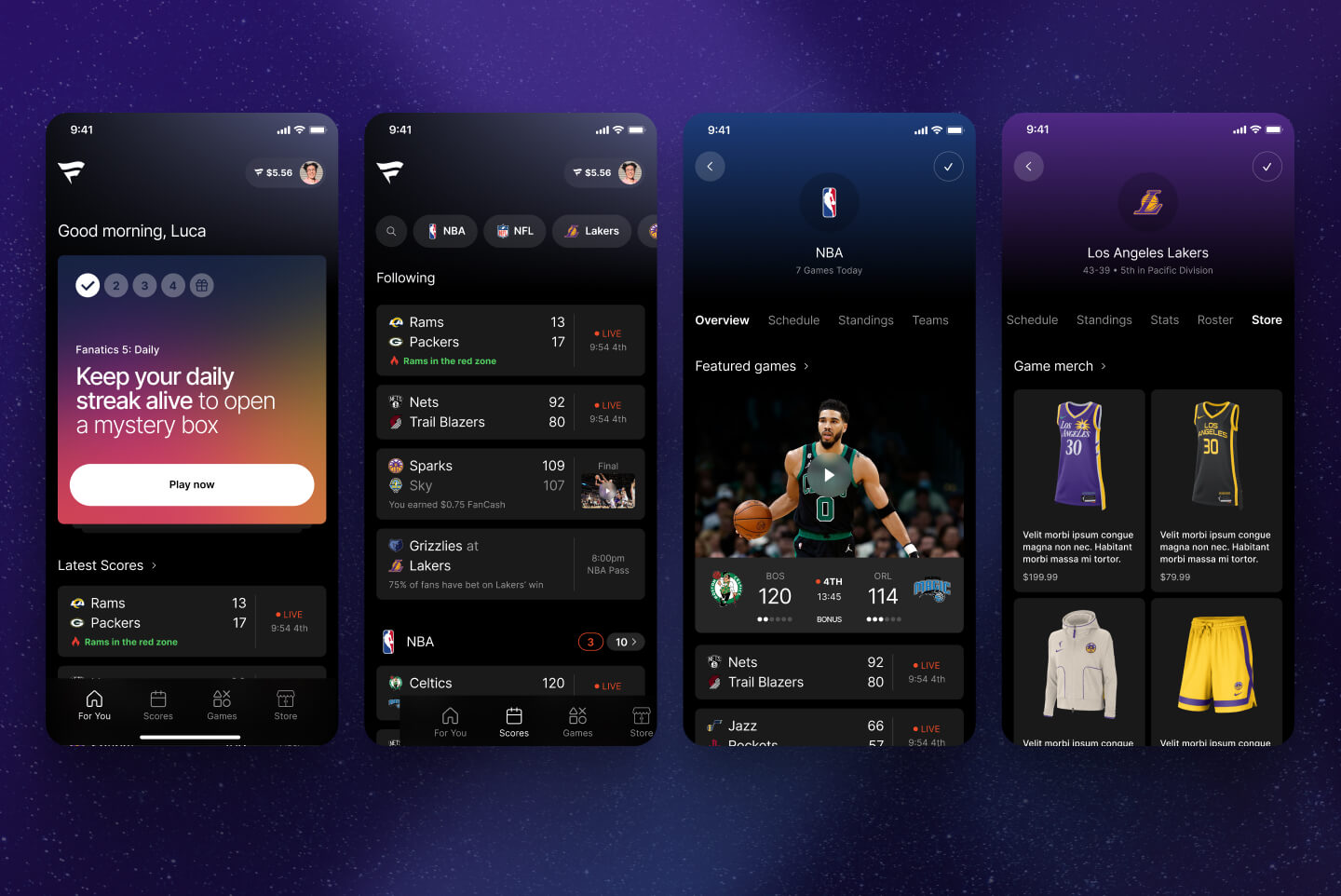
A Complicated Bet Slip: The bet slip is the “shopping cart” of a sportsbook. Many are poorly designed, making it difficult to understand how to place a single bet versus a parlay, and how the potential payout is calculated.
Lack of Trust: For new users, depositing real money requires a huge leap of faith. The interface must feel secure, professional, and trustworthy at every step.
Core Principles for a User-Friendly Sportsbook
To overcome these barriers, my design process for a new-bettor-friendly platform focuses on four key principles.
1. Guided Onboarding
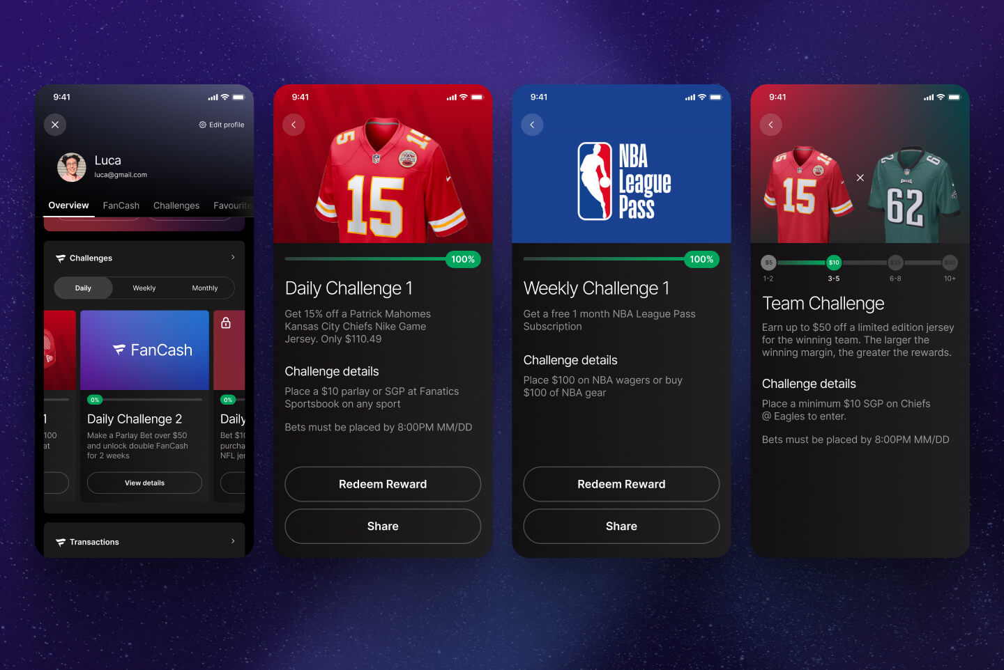
A user’s first 60 seconds are critical. I design onboarding flows that don’t just ask for information, but also provide value. This can include simple, interactive tutorials that explain what “-110” means or how a point spread works, giving users the confidence to place their first bet.
2. Clear Visual Hierarchy
A user-friendly interface is not about removing information; it’s about presenting it in a clear, logical order. I focus on creating a strong visual hierarchy that surfaces the simplest bet types (like “Who will win?”) first, while allowing more experienced users to easily drill down into more complex markets like player props.
3. Plain Language & Explainers
Jargon is a trust killer. I replace industry jargon with plain language wherever possible. For essential terms like “spread,” I design small, contextual info-tips or “What does this mean?” links that provide simple, on-demand explanations without cluttering the main interface.
4. Building Trust Through Design
Trust is built through a professional UI, clear communication, and a secure feel. This includes using familiar design patterns for registration and deposit flows, providing clear confirmation screens after a bet is placed, and making it easy for users to find their bet history and account information.
Ready to Improve Your Sportsbook’s User Experience?
Building a user-friendly sportsbook is not about “dumbing down” the experience. It’s about creating a clear, trustworthy path for new users to become confident, engaged customers. This is how you win the market.