The Big Data Revolution has completely changed the sports industry. From performance monitoring and outcome predictions to fan engagement, there is not an area of elite sport that hasn’t been impacted by the use of data and analytics.
However, by failing to place the end user at the centre of the design process, any amount of data and insights could be rendered useless.
In this short guide, we’ll share with you a simple method to help turn your data and insights from complex to easily digestible.
DATA CAPTURE
Sports data can be captured in a number of ways. At the most basic end, data scouts and score keepers manually update real-time stats. Wearables have risen in popularity and have become accessible for a range of athletes. Products, from the likes of Catapult and Garmin, have become a vital part of professional athlete performance monitoring.
More recently, there has been a rise in AI to analyse real-time or post-event video and output accurate data.
DATA USAGE
Professional sports teams, college athletic departments, and even high school coaches use sports data to help them make better decisions.
Athletes have their every move and performance monitored and analysed in real-time, allowing coaches to monitor performance from the sidelines and make informed decisions on the go. AI and Machine Learning is turning data into outcome predictions from in-game events to player recruitment.
It doesn’t stop with the athletes, fans are benefiting from the use of data with enhanced engagement experiences with the teams they love.
DATA BASED RULE CHANGES
On February 17th, four days after the Rams’ Super Bowl victory, the NFL ops department got to work on the 2022 season. They undertook their annual football “data dump’’— a 360-degree review of every tech-infused analytic from 2021.
During the 2021 season, the NFL tagged every football, every player, and every referee with a Radio Frequency Identification (RFID) chip on gamedays.
Using this data, the ops team will present their 2022 rule change recommendations to the league’s competition committee.
DATA GUIDED SPORTS BETTING
Sportradar launched public stock in September with an $8 billion valuation. With The NBA and NHL both holding equity in the company, with NBA legend Michael Jordan and the Dallas Mavericks owner Mark Cuban listed as investors.
Sportradar represents 85% of U.S. bookmakers. Their services range from helping large sportsbooks, like DraftKings and FanDuel, to attract and retain customers by identifying and profiling potential clients, to providing odds, live data, and managed trading services.
DATA DRIVEN FAN ENGAGEMENT
Sports teams are finding innovative ways to engage their fans. Digital ticketing and biometric stadium entry systems are opening doors for sports teams. This along with data gathered from interactive fan experiences, allows teams to be able to gather important information about who’s attending the game.
A deeper knowledge of fan’s profiles could enable more precise targeting. For example, by mining past attendance data, teams could use targeted promotions or offer personalised discounts to drive repeat ticket purchases for games similar to those they’ve previously attended.
DATA OVERLOAD
Despite these great examples of how data is being used to enhance sporting performance and consumption, the amount of data available poses some big design challenges.
No matter how great your product’s data is, or powerful the insights it provides are, often they can be rendered useless to a user if they are too hard to digest.
By placing the end user at the centre of the design process, you can present data in a way that is both easily digested but retains its power and value. Making the complex, simple.
DIGESTIBLE INSIGHTS
There are many ways to design a product which displays insights and data to an end user. But without structure and a clear strategy, they can easily fall short.
You could design the most beautiful data visualistion dashboard ever seen, but if the data is hard to digest or insights take too long to discover, your user will soon grow tired.
By utilising a clear content strategy, you can create a product to cater for all types of users.
THE BITE, SNACK, MEAL APPROACH
The Bite, Snack, Meal approach was first put forth by Leslie O’Flahavan in 1997 but was popularised in the 2001 Inc. article she co-wrote with Marilynne Rudick, her former business partner.
Originally developed as a way of organising content for the internet, the Bite, Snack, Meal approach involves writing for the appetite of a varied audience.
However, this approach can be used when structuring the insights and data your product has to offer.
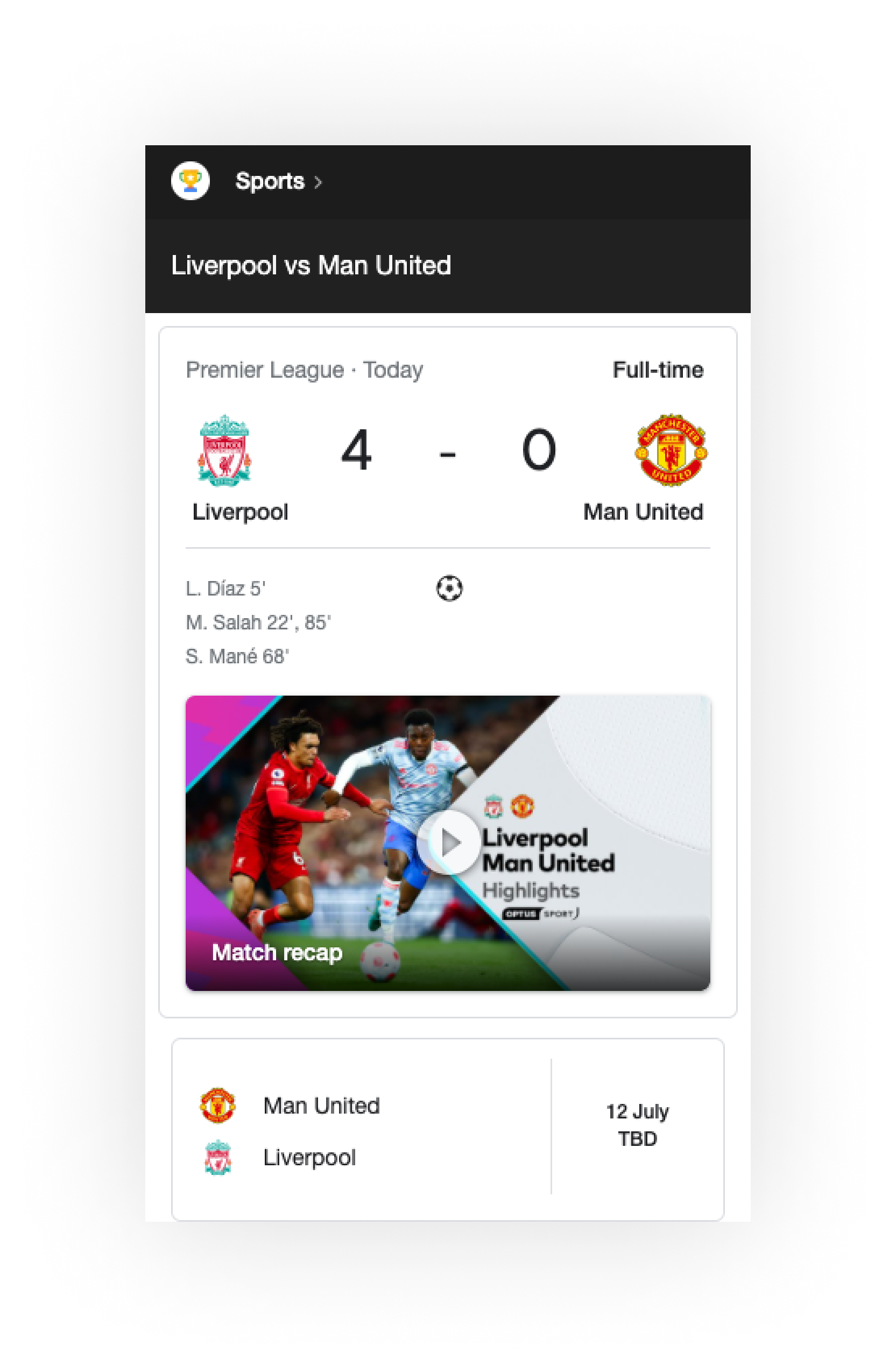
THE BITE
The Bite needs to hold enough content to enable the user to get the full insight, while driving them to next level of engagement.
A great example of the Bite, Snack, Meal approach can be seen in the common patterns used to display sports results.
This image shows a Bite of information for a soccer game. This is just enough information to enable the user to fully understand who played, the live score or result, and some basic details such as the goal scorers.
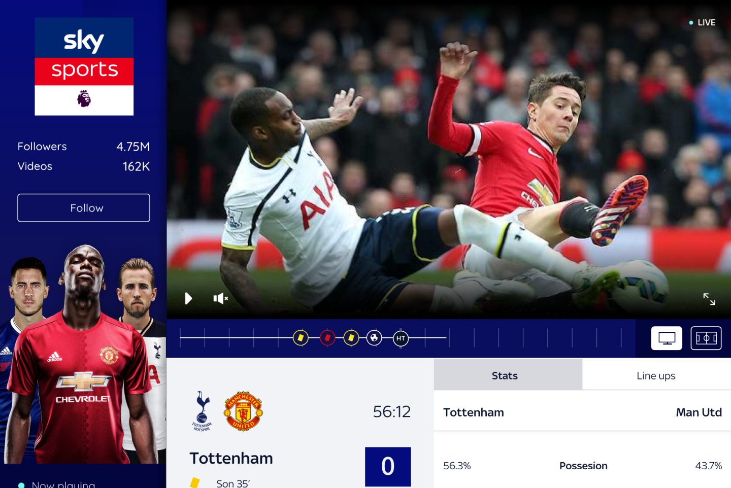
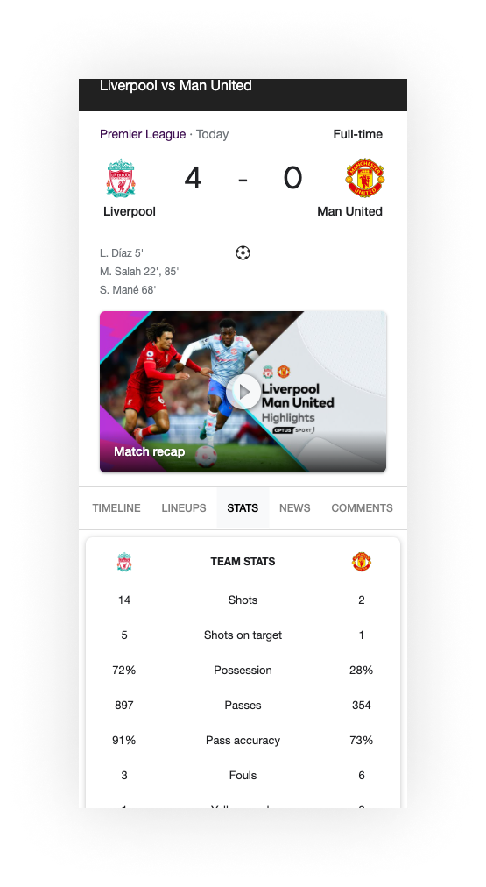
THE SNACK
The Snack should provide a concise summary that provides enough information for a content overview. Often when looking at insights or a soccer result, we cannot get the full story from the headline or scoreline alone.
The Snack of content shows all the Bite information, but it is backed up by more detailed insights. For example, on the right you can see a full list of game stats detailing the full story of how the game unfolded. This allows the user to gain more context around the top-level insight.
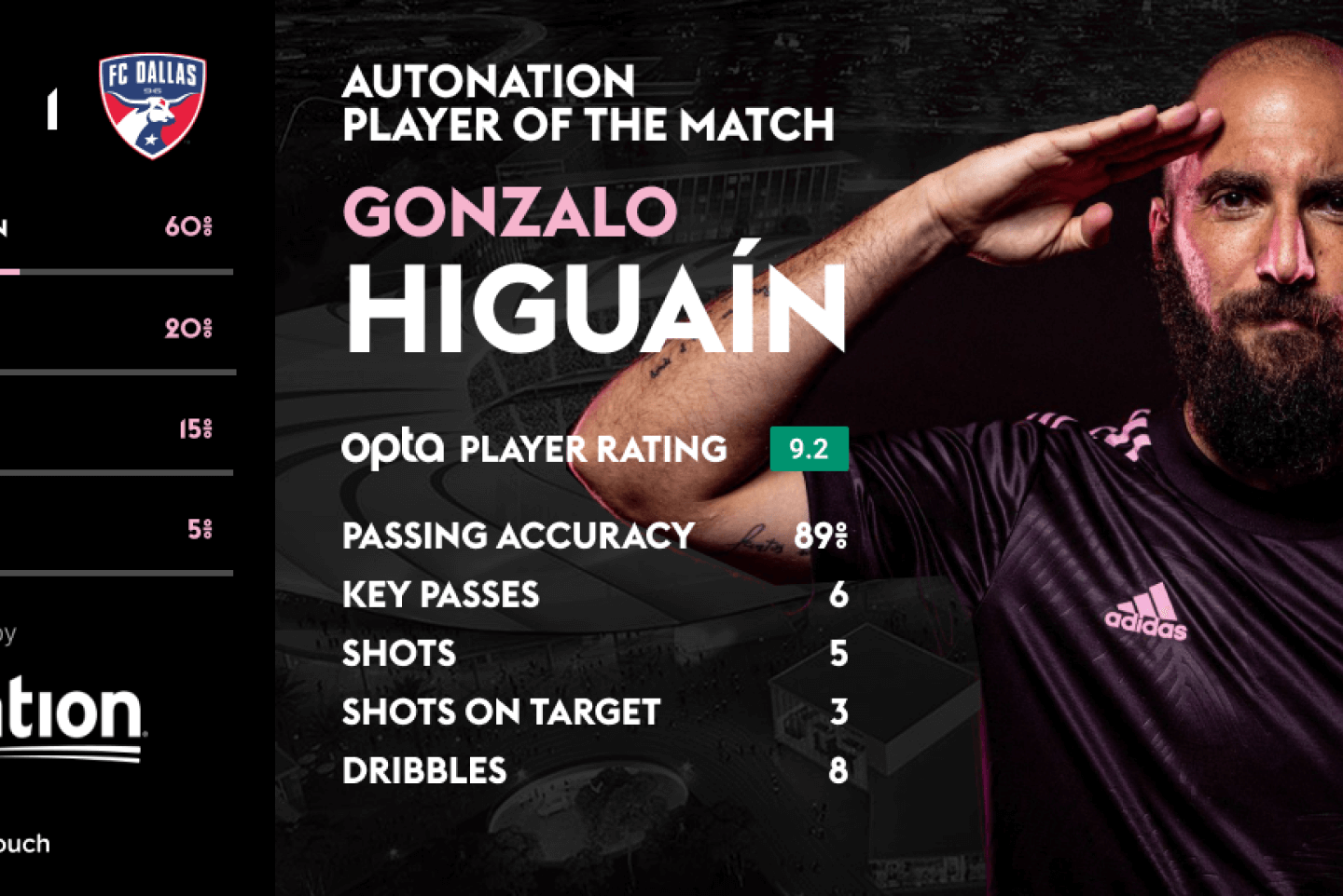
THE MEAL
The Meal should provide the full, unedited story. This is for the users who have the need, desire, or inclination to understand every detail.
Following on the example previously shown, we can see that in addition to the Bite and Snack content, the user can get the full story or Meal.
At this level the user can access everything from the full, play-by-play live game commentary, post-match analysis and insights and watch game highlights.

WHEELY GOOD
Activity sharing website Strava allows users to track and upload their rides using GPS data, either from Strava’s dedicated app on a smartphone, or via a third-party GPS bike computer, such as those from Garmin.
Strava’s service not only allows millions of cyclists to connect with each other, with the facility to comment on each other’s rides and give ‘kudos’ where they think the effort deserves it. But it also gives valuable insights into the cyclists performance.
The Strava app provides a great example of how the Bite, Snack, Meal approach can be used to provide the right amount of content to a user when they require it.
THE BITE
At the Bite level users learn that Chris Froome has completed a ride with the time, location, distance travelled and elevation gain displayed.

THE SNACK
At the Snack level users learn more details from Chris’ ride. For example total moving time, average speed, calories burned and what equipment he used.

THE MEAL
At the Meal level users can get detailed performance insights and analysis of Chris’ ride. This includes charts and detailed data for a variety of metrics.

CONCLUSION
The Bite, Snack, Meal approach is an excellent way to structure the data and insights your product offers, but it is by no means the full solution. It must be backed up with a user experience and interface that is intuitive and easy to use.
In addition to this it is vital to talk to your users and test your approach regularly. This will allow you to iterate your product and really refine the way your data and insights are presented to the user.
How could your product benefit from The Bite, Snack, Meal Approach?