
From Text to Tangible Product
Every startup founder has a detailed document they believe in. For HotTakes, it was a comprehensive brief for a new social sportsbook. My job was to be the first person to make it real. This is the story of how we went from a text-based vision to an investor-ready product.
This is the kind of challenge I specialise in through idea development: taking early concepts and translating them into functional, testable, and fundable products.
HotTakes, a promising young startup from Canada, had a meticulously detailed vision: to create a free-to-play social sportsbook where friends could compete, win real cash prizes, and earn even more through sportsbook promotions. The founders had the “what” and the “why” perfectly defined in a multi-page brief. What they lacked was a design partner to translate this ambitious plan into something tangible, investor-ready, and visually exciting.
My Role: Founding Design Partner
I worked directly with the founders as their lead product designer, embedding myself in their early-stage process. My role was to be the architect of their vision. This involved taking the comprehensive product brief and systematically translating it into intuitive user flows, designing the complete user interface for every screen, establishing a compelling visual identity, and building a comprehensive UI Toolkit to ensure consistency and accelerate development.
The engagement followed my sports tech product design consulting process, ensuring every design decision aligned with both the product vision and commercial goals.
The Solution: A Feature-Rich and Engaging MVP
My approach was to systematically translate every requirement from the brief into a polished and intuitive design solution.
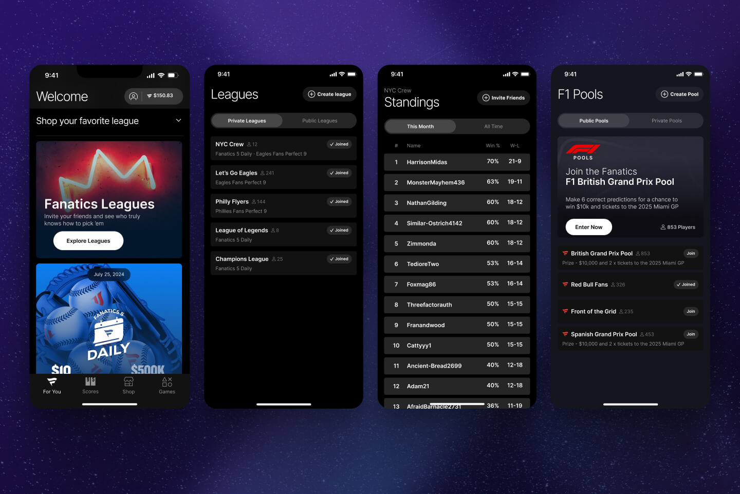
1. The Core Gameplay Loop: Fast, Intuitive Pick Selection
The heart of the app is making picks. The brief required a fast, fluid, and powerful system. I designed a solution featuring:
- Horizontally scrolling filters for leagues and pick types for quick navigation
- A modal “pick builder” that elegantly rises from the bottom of the screen, allowing users to easily add selections and toggle between straight wagers and parlays without losing context
- A clear presentation of odds and potential winnings to create an authentic sportsbook feel

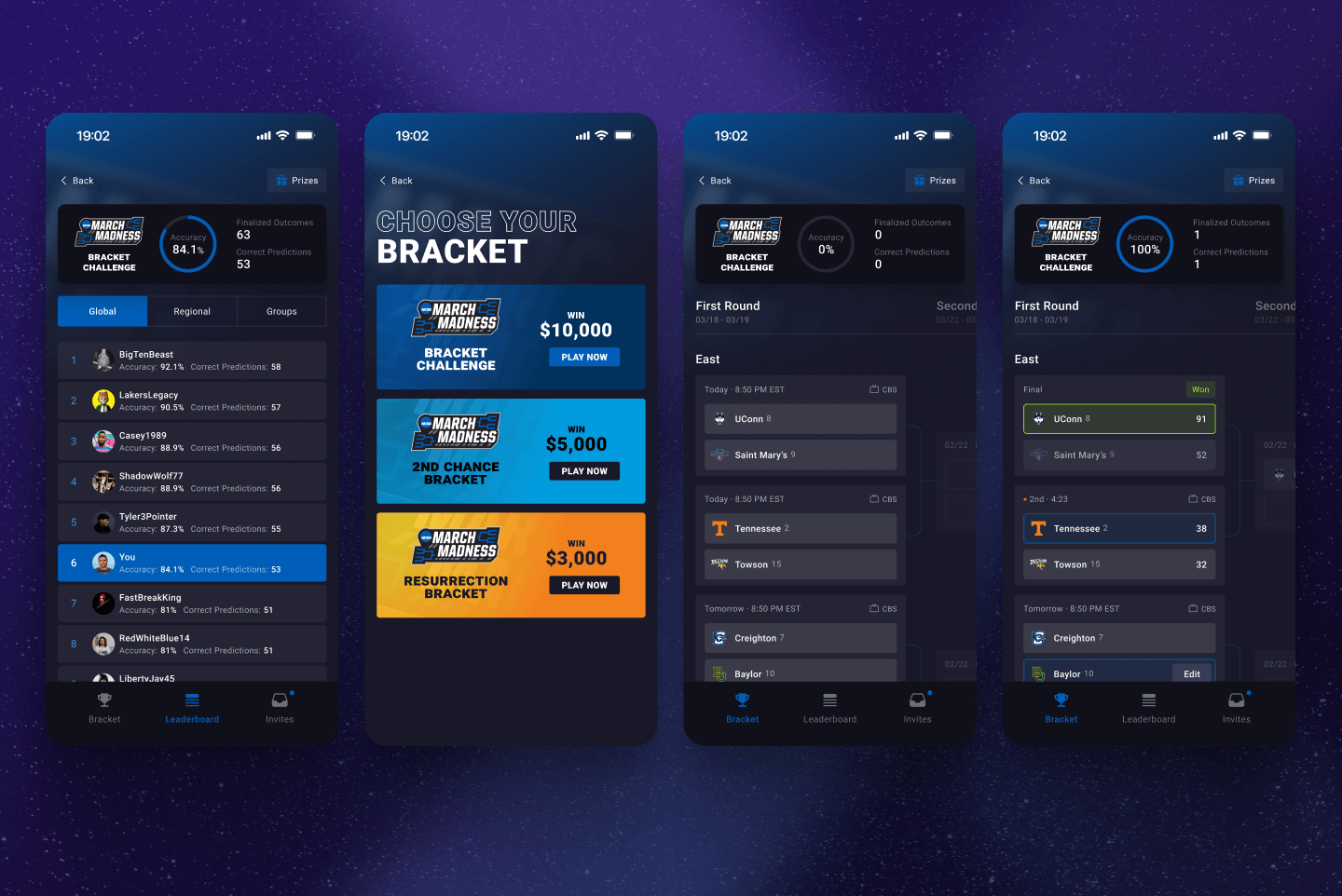
2. Making Progression Feel Aspirational
To drive long-term retention, the brief called for a rich progression system. I designed a multi-level ranking system (Rookie, Champion, All-Star, and Elite) but knew it needed a strong visual identity to feel meaningful.

3. Designing the Monetisation Engine
A core part of the business model was referring users to sportsbook partners. I designed a “Deals” page that gamified this process to feel like a natural part of the app experience. This included:
A “spin the wheel” mechanic for a recurring bonus to encourage repeat visits
A clear, multi-step progression bar showing users exactly what they needed to do (e.g., Sign Up, Deposit, Bet) to unlock progressively larger rewards
Smart UI that visually “unlocked” the next step in the process only after the previous one was completed, guiding the user through the conversion funnel

4. Building a Foundation for Growth: The UI Toolkit
For a startup, speed and consistency are everything. Beyond the initial screens, I created a full UI Toolkit for HotTakes. This comprehensive design system included defined components, typography, color palettes, and spacing rules. This wasn’t just a set of designs but a scalable system that would empower their future in-house team to build new features quickly and consistently long after my engagement was over.

The Impact: A Complete Product Framework to Accelerate Launch & Secure Investment
For a startup like HotTakes, my work delivered critical business value far beyond just a set of screens.
Provided a Tangible Vision to Secure Investment: The comprehensive designs transformed a text brief into a high-fidelity, clickable prototype. This was a crucial asset that enabled the founders to clearly demonstrate their vision to investors and successfully secure their next round of funding.
Accelerated the Development Roadmap: By delivering a complete, end-to-end MVP design and comprehensive UI Toolkit, I provided an unambiguous specification for the engineering team. This de-risked the technical build and allowed them to bypass months of internal discovery work, moving directly into development with a clear roadmap.
Established a Foundation for Scalable Growth: The scalable design system I created ensured that the product could grow and evolve efficiently, empowering the in-house team to build new features quickly and consistently long after my engagement was over.
Professional note: This case study showcases the foundational MVP design and UI Toolkit I created as a founding design partner. The final execution and continued iteration are handled by the client’s internal team.
Sports Product Strategy & UX Design Case Studies
Clear, outcome-focused case studies showing how I’ve helped sports brands simplify complexity, sharpen their product direction and design experiences that keep users returning.


HAVE YOU Got a product idea or an app that’s falling short?
Tell me about your challenge or book a quick 20-minute conversation to get started.